

Portfolio: Navigation
Styling the Navigation Links
Now that we've styled the list so that it floats in a horizontal line and gave it some additional properties to look like a navigation menu, we will finish up by styling the links.
You may have noticed that we didn't really mess with the font properties while styling the list. When we make a body of text a link, it adds the <a> element to the text, nesting it within the <li> tag. The font properties of the <a> tag overide the font properties of the <li> tag, so this is why we adjust the font properties of the <a> element.
Styling the <a> Tag
- Place the cursor in any of the navigation list items
- In the Tag Selector at the bottom of the Document Window, Click the <a> tag – the <a> tag should appear to be selected in a bubble (see below image for reference)
- Next, Click the New CSS Rule button in the CSS Styles Panel
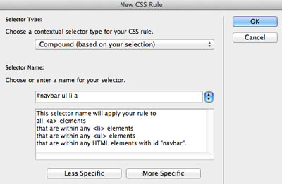
- The New CSS dialogue box opens
- In the Selector Name box, you should see "#wrapper #navbar ul li a"
- We don't need to include the #wrapper id in this selection, so click the Less Specific button one (1) time
- In the Selector box, it should now read "#navbar ul li a" – see image below for reference
- Click OK
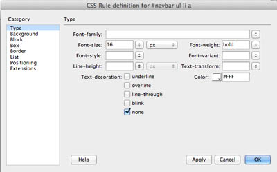
- The CSS Rule Definition for #navbar ul li a dialogue box opens
- Select the Type property in the Category column if isn't showing already
- In the Font size box, Type "16" and leave the unit at px (pixels)
- In the Font weight drop down menu, select "bold"
- Click the Color picker box and select white (#FFF)
- In the Text Decoration list, check "none"
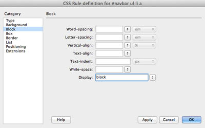
- Next, Select the Block property in the Category column
- In the Display drop down menun, select "block"
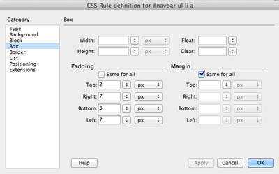
- Select the Box property in the Category column
- In the Padding section, UNCHECK the "Same for all" box
- Type the following values:
- Top box – "2" – leave the unit at px (pixels)
- Note: Depending on the type of default font you used, you may need to play around with the padding value so the navigation list fits squarely inside the navbar <div>. If you notice the text "Content for id "content" goes here" floating to the right in the content <div>, then you will need to reduce the top padding value to 2 pixels
- Bottom box – "2" – leave the unit at px (pixels)
- Left and Right – "7" – leave the unit at px (pixels)
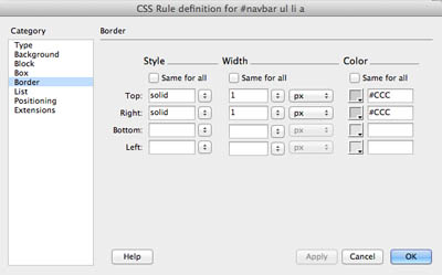
- Select the Border property in the Category column
- UNCHECK the "Same for all box" for each section (Style, Width, Color)
- We will add a border for the TOP and RIGHT only
- Select "solid" from the Style drop down menu
- Type "1" in the Width box – leave the unit at px (pixels)
- Click the Color picker and select the light gray (#CCC)
- Click OK
- Your navigation list should be styled like the image below


Adding Link Interactivity with the Hover Psuedo-class
We're going to add a bit of interactivity to the navigation menu by adding the psuedo-class hover to the <a> tag
- Place the cursor in any of the navigation list items
- In the Tag Selector at the bottom of the Document Window, Click the <a> tag – the <a> tag should appear to be selected in a bubble (see below image for reference)
- Next, Click the New CSS Rule button in the CSS Styles Panel
- The New CSS dialogue box opens
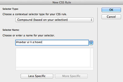
- In the Selector Name box, you should see "#wrapper #navbar ul li a"
- We don't need to include the #wrapper id in this selection, so click the Less Specific button one (1) time
- In the Selector box, it should now read "#navbar ul li a"
- Place the cursor right after the "a" and type a colon (:) followed by "hover" – see image below for reference
- Click OK
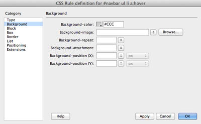
- The CSS Rule Definition for #navbar ul li a:hover dialogue box opens
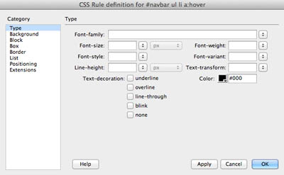
- Select the Type property in the Category column if isn't showing already
- Click the Color picker box and select black (#000)
- Select the Background property in the Categroy column
- Click the Color picker box for the Background color and Select light gray (#CCC)
- Click OK
- You won't see anything different in the index.html document until you preview or see it in Live View
- Click the Live View Button at the top of the document window, then hover the mouse over the navigation menu – you should see the navigation links change font color and background color!
Next Steps
In the next exercise, you will learn how to create new pages from one that is already designed.
